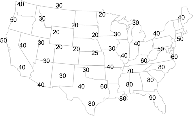
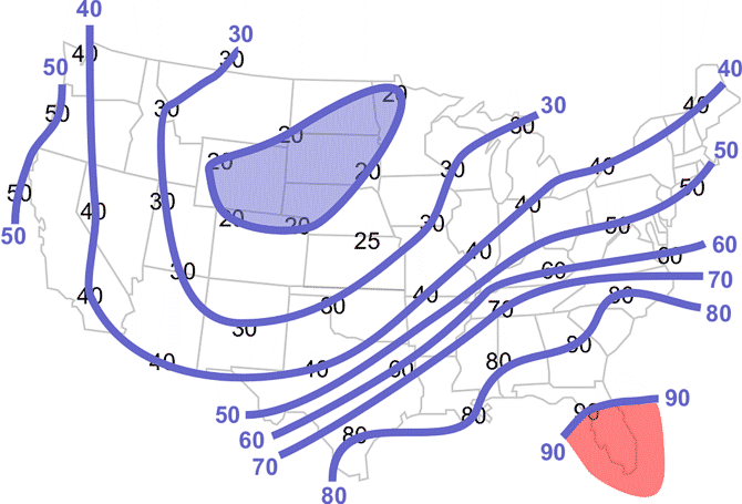
This map shows the air temperature for various locations over the contiguous U.S. The values are in °F.
- Objective
- Using a blue colored pencil, lightly draw lines connecting equal values of temperatures every 10°F. Remember, like isobars, these lines (called isotherms) are smooth and do not cross each other.
- Procedure
-
You will draw lines connecting the temperatures much like you did with the sea-level pressure map. However, you will also need to interpolate between values. Interpolation involves estimating values between stations, which will enable you to properly analyze a map.
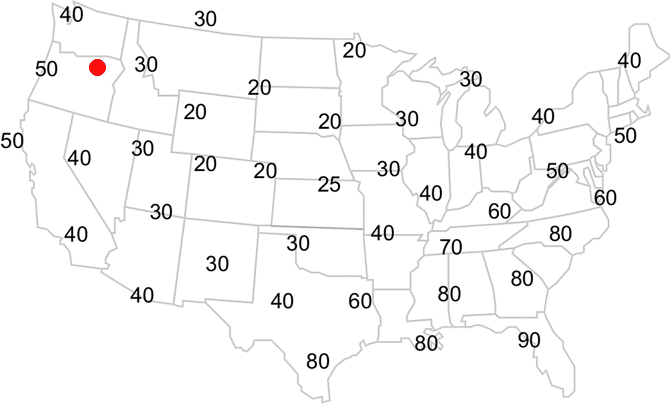
We will begin drawing from the 40°F temperature in Seattle, Washington (top left value). Since we want to connect all the 40°F temperatures together, the nearest 40°F value is located in Reno, Nevada, (southeast of Seattle). However, in order to get there, you must draw a line between a 50°F temperature along the Oregon coast and a 30°F temperature in Idaho. Since 40°F is halfway between the two locations, your line from Seattle should pass halfway between the 50°F and 30°F temperatures.
Place a light dot halfway between the 50°F and 30°F temperatures. This is your interpolated 40°F location.
Your map should look like this.
 Learning Lesson: Drawing Conclusions - Temperature Analysis
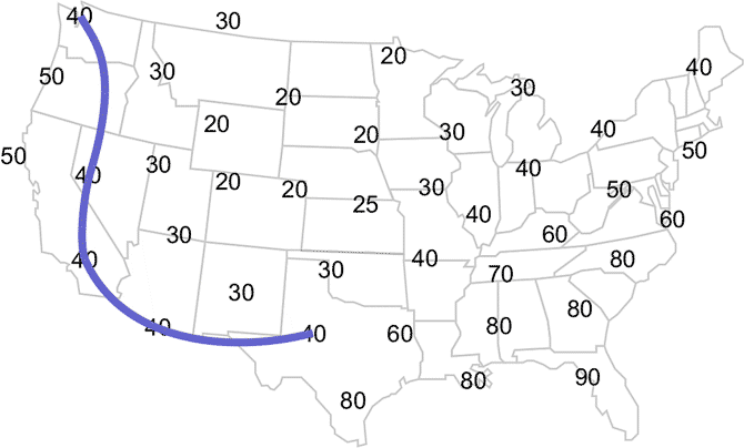
Next connect the Seattle 40°F temperature with the Reno 40°F temperature, ensuring your line moves through your interpolated 40°F temperature. Continue connecting the 40°F temperatures until you get to Texas.
Your map should look like this.
 Learning Lesson: Drawing Conclusions - Temperature Interpolation
Now your line will pass between two values, 60°F and 30°F. Like the last time, you should make a mark between the 60°F and 30°F, but this time, they are 20° apart, so 50°F must also be interpolated in addition to the 40°F. Between the 60°F and 30°F temperatures, place a small dot about 1/3 the distance from the 30°F and another small dot about 2/3 the distance from the 30°F. These dots become your interpolated 40°F and 50°F temperatures.
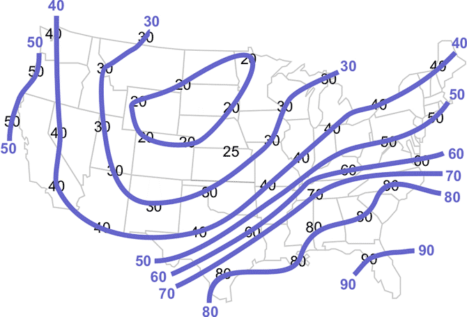
Finish drawing your 40°F isotherm passing through your interpolated 40°F value. Repeat the above procedures with the other isotherms drawn at 10°F intervals. Label your isotherms.
Your map should look like this.
Learning Lesson: Drawing Conclusions - Completed Isotherms - Analysis
-
Isotherms are used to identify warm and cold air masses.
- Shade in blue the region with the lowest temperatures.
- Shade, in red, the region with the warmest air.
Your map should look like this.
-
 Learning Lesson: Drawing Conclusions - Where are the air masses?


