
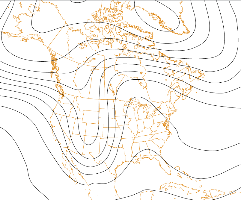
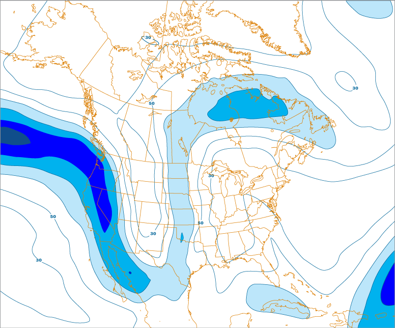
Height Contours
One thing all upper air charts have in common are the height lines (contours) themselves. These lines represent the altitude (in meters) of various significant pressure levels. On any given constant pressure chart, the air pressure is the same at all locations.

What varies on constant pressure charts is the altitude where that particular pressure occurs. In effect, this means these constant pressure charts actually show three-dimensional undulations in the atmosphere.
These undulations represent different densities (due to different air temperatures) in the atmosphere. The height of any pressure level is determined by the density of the air below it. As the air temperature decreases, the air's density increases.
Therefore, the altitude where any particular pressure occurs will be lower in regions of colder air. Conversely, higher air temperatures result in relatively higher altitudes of various pressure levels. This is why, as a rule, the altitude of constant pressure levels decrease from the equator toward the poles simply because it is warmer at the equator than at the poles.
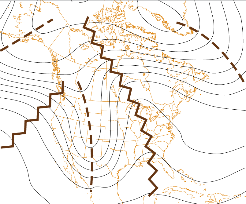
The areas of lower heights (colder, more dense air) are called troughs. The regions of higher heights (warmer, less dense air) are called ridges.
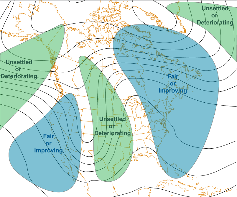
Troughs are typically indicated by brown dashed lines with ridges indicated by brown zig-zag lines. We typically experience fair weather under upper level ridges and unsettled weather near upper level troughs.
In the upper air (usually 500 millibar level or higher), fair (or improving) weather conditions generally occur between the ridge and the downwind trough. Unsettled (or deteriorating) weather generally occurs between the trough and the downwind ridge.
All upper air charts use the metric system for heights (and temperatures).
Wind Direction
The motion of the air in the upper atmosphere is usually west to east in both the Northern and Southern Hemispheres and will parallel or closely parallel the contours.
Wind Speed

When the height contours (lines) are close to each other, it means there is a more rapid change in altitude of the constant pressure level, an indication of a large temperature gradient.
As the temperature gradient increases (more rapid change), so does the pressure gradient. Wind is created when there is a pressure gradient, and the stronger the gradient, the stronger the wind.
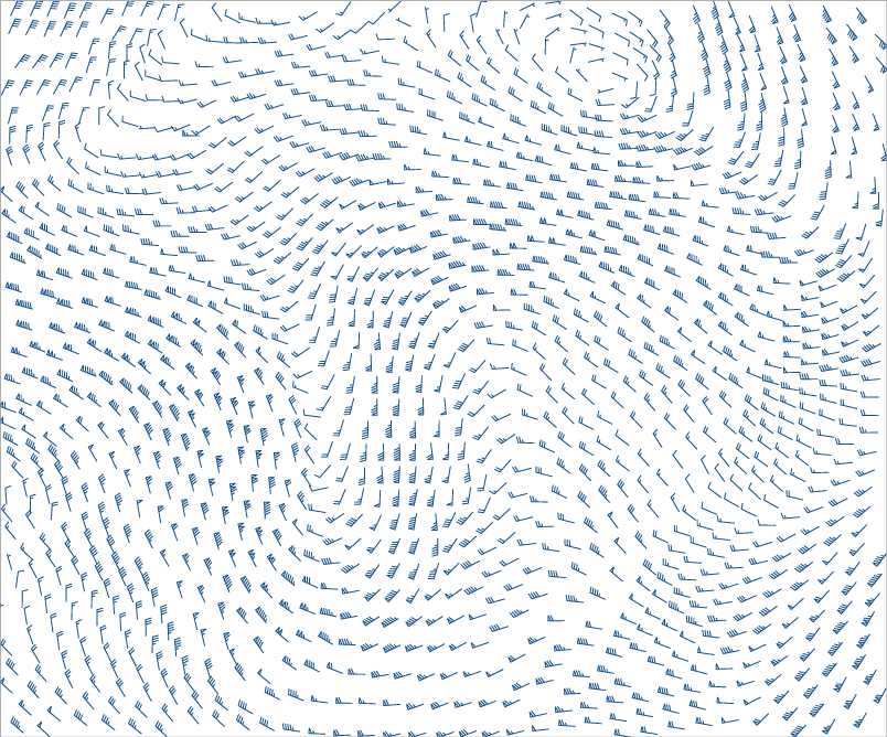
Wind speeds on weather maps are in knots (kt); one knot equals 1.15 mph and 1.85 km/h. Toggle the "Wind Barbs" check box to display the speed and direction of the wind across the map below.
The wind barbs indicate wind direction and wind speed (rounded to the nearest 5 knots). The longest line (shaft) points in the direction FROM which that wind is blowing.
The shorter lines, called barbs, indicate the wind speed in knots (kt).
Each long barb represents 10 kt and short barbs represent 5 kt. A pennant is used to represent each 50 kt. Total the barbs and pennants to determine the wind speed at that location.
When lines of equal wind speed are drawn (called isotachs), the regions of greater and lesser wind speed stand out. Isotachs are typically drawn for every 20 kt.
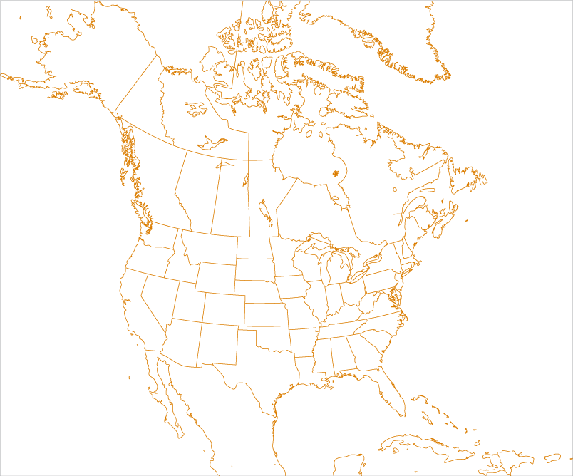
On the map below, the check boxes will toggle overlays that show some of the common features of upper air charts.
As a radiosonde ascends, it reports the pressure levels of significant changes in temperature and humidity. However, there are also specific pressure reporting levels of temperature and humidity that are the basis for the creation of constant pressure charts.
By world-wide convention, constant pressure charts are typically created for the 200 mb, 300 mb, 500 mb, 700 mb and 850 mb pressure levels. Together, these five levels give the meteorologist a good representation of the state of the atmosphere.